HMI Design Best Practices
The most useful control-room screen is often the most boring-looking one. Here is why high-performance HMI design trades color and gloss for calm, and how that calm keeps operators in command.
TL;DR
Colorful, glossy HMI screens look impressive in design reviews and become noise during an upset. High-performance HMI design uses muted grays so that color means abnormal, shows values in context with trends and ranges, organizes screens in a clear hierarchy and keeps alarms meaningful, so operators stay in command.
There is a particular kind of HMI screen that engineers are quietly proud of and operators quietly dread. It is the colorful one: pipes in red, green, and orange, vessels rendered in glossy three dimensions, pumps that spin when they run and glow bright green around the edges, numbers scattered across the picture like confetti. It looks technical and impressive in a design review. It looks like a wall of noise at three in the morning when something has gone wrong and an operator has thirty seconds to work out what.
The uncomfortable truth, learned across the process industries and written down in works like The High Performance HMI Handbook, is that the impressive screen is usually the worse screen. The redesign that helps operators most tends to look, frankly, dull. Mostly gray, flat, quiet. That is not a failure of imagination. It is the whole point.
To see why, start with what an HMI is actually for. It is not decoration and it is not a data dump. It is the window through which one human keeps a physical process inside safe limits, especially when that process misbehaves. The right measure of a screen is whether it builds the operator’s situational awareness, their accurate sense of what is happening now, what is about to happen, and what they should do about it. Everything else is vanity.
Now look again at the colorful screen through that lens. Color is the strongest signal you have for grabbing attention. If everything on the screen is colorful, color means nothing, and the operator’s eye has nowhere to land. Bright green on every running pump feels reassuring to the designer, but it spends all your visual headroom on the normal state, leaving nothing left over to make a real fault stand out. The fundamental problem is that on the rainbow screen, a plant running perfectly and a plant in crisis look almost identical. The operator has to read and compare numbers in their head to tell the difference, and reading takes time the upset does not give them.
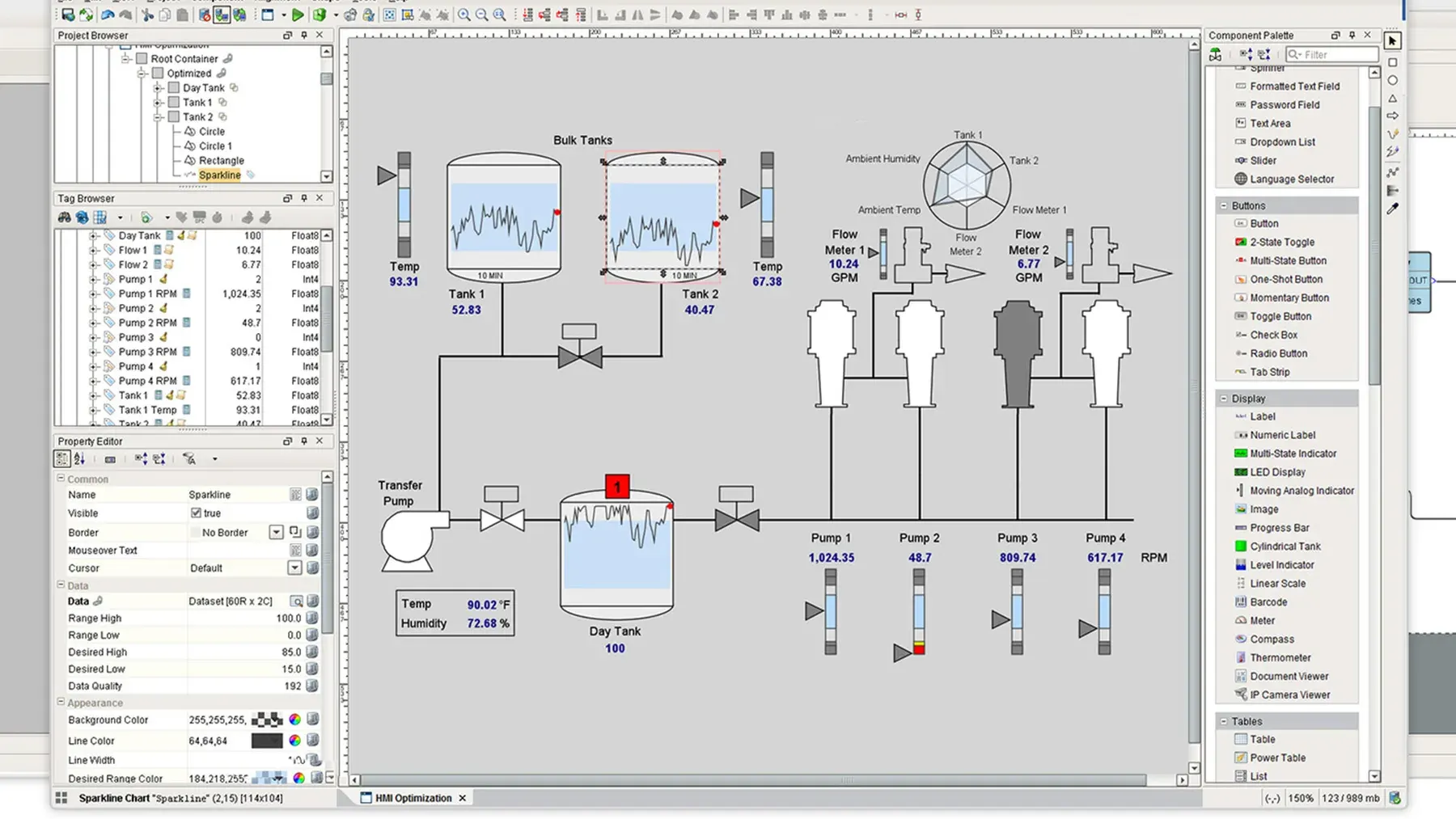
High-performance HMI fixes this by inverting the habit. Start with a calm, neutral gray background, the kind that is comfortable to look at for a twelve-hour shift. Draw the equipment in low-saturation gray, flat shapes, no three-dimensional rendering, no spinning animation, no gloss. Show a running pump quietly, with a simple fill and a small label, not a bright green halo. And then hold all your strong color in reserve for one purpose: abnormal conditions and alarms. On a screen built this way, a fault is the only colorful thing in view. It is impossible to miss precisely because everything else is quiet. Run the two-second test, show the screen to a stranger for two seconds and ask if anything is wrong, and they can point straight at the problem.
There is a discipline that goes with the color: never rely on color alone. A meaningful share of operators have some degree of color vision deficiency, and red and green, the very pair so many legacy screens lean on, are the hardest to tell apart. So every alarm gets a second cue, a shape change, a text label, a blink until acknowledged, so it survives both color blindness and a grayscale printout. Good design does not assume a perfect viewer.
Calm color is only half the story. The other half is turning numbers into understanding. A bare digit reading “78%” tells you the present and nothing else. Pair it with a small analog indicator, a flat bar showing the value’s normal band and its alarm limits, and the operator sees at a glance that 78 percent is comfortably inside the normal range but edging toward the high limit, no mental arithmetic required. Add a trend, the value plotted over the last half hour with the limit drawn as a line, and now the operator can see the future implied by the past: a level that has been climbing steadily for ten minutes is a warning even while it still reads “normal.” This is the difference between an operator who reacts to alarms and one who acts before them.
The same restraint shapes how screens are organized. No single display can show a whole plant without becoming clutter, so screens are arranged as a hierarchy, an overview that answers “is everything all right?” at a glance, area screens for daily operation, equipment screens for diagnosis, and faceplates for individual devices. The operator starts broad and drills only as deep as the task needs, with navigation and the alarm banner in the same place on every screen so moving around never requires thought.
Alarms are where all of this matters most, because a flood of useless alarms is how operators learn to ignore the one that counts. The governing rule of alarm management is brutally simple: if an alarm does not require a specific operator response, it is not an alarm. Apply that honestly, prioritize so that “critical” still means something, kill the chattering nuisance alarms with deadbands, and group related alarms so a single upset does not bury the room in a cascade, and alarms become a trusted signal instead of background noise.
None of this is improvised per screen. The discipline that holds it together, in the spirit of the ISA-101 standard, is a written HMI philosophy: decide the palette, the hierarchy, the navigation, and the alarm conventions once, write them down, and apply them everywhere. That is how one good screen becomes a consistent plant.
So the next time a redesign looks too plain to be impressive, take it as a good sign. The calm, gray, almost boring screen is not the designer giving up. It is the designer getting out of the operator’s way.
Key takeaways 5
- Colorful 3D screens hide what matters during an upset.
- Use gray backgrounds and reserve color for abnormal conditions.
- Show values in context: ranges, trends and targets.
- Organize displays from overview to detail.
- Fewer, meaningful alarms keep operators in control.
Watch & learn

Frequently asked questions
What is a high-performance HMI?
A high-performance HMI is a control-system display designed for situational awareness: muted colors, data shown in context, clear hierarchy and minimal distractions, so operators detect and handle abnormal situations quickly.
Why do high-performance HMIs use gray?
A gray, low-contrast background makes normal operation calm, so the few colors used for alarms and abnormal states stand out immediately.
What standards cover HMI design?
ISA-101 covers HMI design for process automation, and ISA-18.2 and IEC 62682 cover alarm management, complementing guidance such as The High Performance HMI Handbook.
Go deeper with the free masterclass
Workshop, PDF handbook and curated resources for “HMI Design Best Practices”.
Related articles
SCADA Systems Essentials
SCADA is the quiet supervisory layer that lets a handful of operators watch and steer processes spread across an entire region. Here is what every control engineer should understand about how it works.
KPIs & Dashboards for Operations
Most operations track dozens of numbers and steer by none of them. The fix is not more data or a prettier dashboard - it is the unglamorous discipline of choosing the few metrics that actually change what you do.
OKRs & Goal-Setting for Teams
Most teams don't lack ambition - they lack a finish line. Here's what changed when mine started writing goals we could actually score.
Comments
No comments yet. Start the conversation.