Data Visualization Principles
A good chart is not the one with the most colors or the fanciest 3-D effect. It is the one a reader understands correctly in five seconds. Here is how to make those.
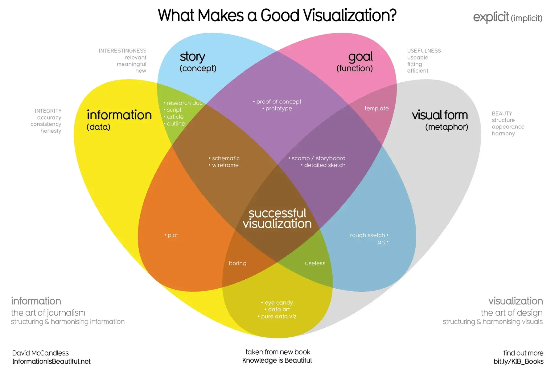
TL;DR
A good chart is one a reader understands correctly in five seconds. Charts work because the eye spots patterns instantly; start from the question, remove everything that doesn't help, use color and honest axes to carry meaning, and give the chart a title that says what it shows.
On this page
We are drowning in charts. They fill our dashboards, slide decks, news articles, and reports. And yet so many of them fail at their one job: helping a reader understand something true, quickly. The good news is that making clear charts is not a mysterious art reserved for designers. It rests on a handful of principles anyone can learn in an afternoon and apply for the rest of their career.
The eye does the work
Start with why charts help at all. A column of two hundred numbers is nearly impossible to grasp. Plot those numbers as a line, and the trend, the peak, and the strange outlier leap out at once. That is because your visual system processes certain properties - position, length, color, size - automatically, in parallel, before you consciously think. Researchers call these preattentive attributes. Scan a page of black numbers for the single red one and you find it instantly; that is the whole reason visualization works.
This also explains why some charts are easier to read than others. People judge position and length very accurately, angles and areas less so, and color shades least of all when it comes to reading exact values. So when you want readers to compare numbers precisely, encode them as bars or points on a scale - not as the slices of a pie, whose angles the eye struggles to compare. Design for how perception actually works, and your charts get clearer almost automatically.
Start with the question
The most common mistake is choosing a chart out of habit and forcing the data into it. The fix is to start somewhere else entirely: with the question you want to answer. Finish the sentence “I want my reader to see that…” and the shape of that sentence tells you the chart.
If you are comparing categories - which product sold most, which region lagged - that is a comparison, and the answer is almost always a bar chart, sorted by value. If you are tracking something across time, that is a trend, and a line chart shows it best. If you are asking whether two things move together, that is a relationship, and a scatter plot reveals it. If you want the shape of a single variable - where values cluster, how wide the spread is - that is a distribution, and a histogram does the job. Pie charts? Reserve them for the rare case of two or three simple slices where the exact comparison does not matter. For everything else, bars beat pies, because length beats angle.
Clarity is subtraction
Once you have the right chart, the next principle is restraint. Edward Tufte coined two ideas worth tattooing on every analyst’s brain: the data-ink ratio and chartjunk. The data-ink ratio is the share of your chart’s ink that actually represents data, as opposed to gridlines, borders, backgrounds, and decoration. Maximize it. Chartjunk is everything that decorates without informing - 3-D effects, drop shadows, textured backgrounds, gratuitous clip art, redundant legends. Delete it.
The habit to build is editing by subtraction. Make the chart, then go through it element by element asking, “does this help the reader answer the question?” Lighten the gridlines. Remove the heavy border. Drop the background fill. Most charts improve the moment you stop adding and start removing. A clean chart is not only easier to read; it reads as more honest, because nothing is hiding the data.
Color and axes carry the truth
Two tools deserve special care because they are so easily abused: color and the axis.
Color is a powerful attention magnet, so spend it deliberately. Do not give every bar its own color - that implies a meaning that is not there. Instead, gray everything out and use a single accent color on the one element you want noticed. The eye goes straight to it. And because roughly one in twelve men cannot distinguish certain colors, never rely on color alone; add labels or direct annotation.
Axes carry an ethical weight. Bar charts must start at zero, because we read bars by length - truncate the baseline and a 5% difference can look like a fivefold one. Line charts, which we read by slope, can use a non-zero baseline, but only if the range is clearly labeled. Keep scales consistent when you compare charts side by side, and never cherry-pick a time window to hide an inconvenient dip. The rule beneath all of this is one sentence: the impression a chart leaves at a glance must match the truth in the data.
Make the chart say something
Finally, let your chart make its argument out loud. A neutral chart leaves readers to draw their own conclusions, and half of them will draw the wrong one. So state the takeaway. The single biggest improvement most charts can get is a better title - swap the bare label “Monthly Revenue” for the sentence “Revenue recovered to pre-slump levels by June.” Then point at the evidence: annotate the peak, mark a target with a reference line, explain the odd spike with a one-line note. Pair those words with emphasis so the reader’s eye lands exactly where the explanation waits. And keep to one message per chart; if you have four things to say, make four charts.
None of this requires talent, expensive software, or a design degree. It requires asking, every time, what you want the reader to see, and then ruthlessly serving that one goal. Choose the chart from the question, strip away the decoration, keep the axes honest, spend color with intent, and say the point out loud. Do that, and your charts will join the small, valuable minority that actually inform.
Key takeaways 5
- The best chart is understood correctly in seconds.
- Start from the question the chart must answer.
- Clarity comes from subtraction: remove clutter, 3D and decoration.
- Use color sparingly and keep axes honest.
- Write a title that states the finding.
Watch & learn

Frequently asked questions
What makes a good data visualization?
It answers a clear question, uses the right chart type for the data, removes unnecessary elements, uses color purposefully and is honest about scales and axes.
When should a bar chart start at zero?
Bar charts should almost always start at zero, because readers compare bar lengths. Line charts can use a non-zero baseline when they show change over time.
Should I use 3D or pie charts?
Avoid 3D charts, which distort values. Pie charts only work for a few parts of a whole; bar charts are usually easier to compare.
Go deeper with the free masterclass
Workshop, PDF handbook and curated resources for “Data Visualization Principles”.
Related articles
Building Dashboards with Power BI & Grafana
Two of the most popular dashboard tools live in different worlds. Knowing which world you are in is most of the job.
Practical Big Data Analytics
Everyone wants to say they work with big data. The freeing truth is that almost nobody does - and that means your laptop is more powerful than you think.
Data Storytelling & Communicating Insights
Your analysis was right. The meeting still ended in "thanks, very interesting." Here is the craft that closes the gap between a correct finding and a changed decision.
Comments
No comments yet. Start the conversation.