Building Dashboards with Power BI & Grafana
Two of the most popular dashboard tools live in different worlds. Knowing which world you are in is most of the job.
TL;DR
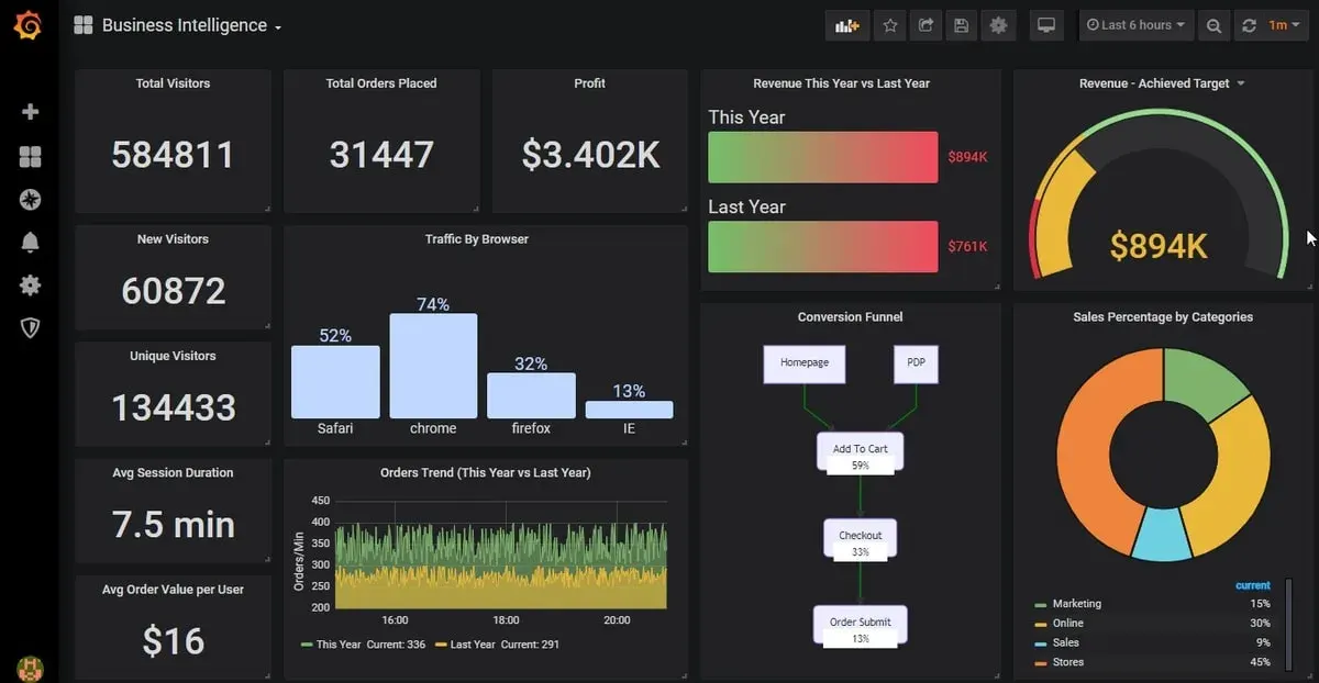
Most dashboards go unread because they answer no real question. A dashboard is a tool for a specific person to make a specific decision fast. Power BI suits business analytics on modeled data; Grafana suits real-time operational and time-series monitoring. The question picks the tool.
On this page
The dashboard that nobody reads
Walk into almost any company and you will find a dashboard that nobody reads. It was built with care. It has dozens of charts, every filter you could want, a gradient header, and a number for everything. And it sits ignored, because it answers no question anyone is actually asking.
The failure is rarely technical. It is a failure of purpose. A dashboard is not a place to put data; it is a tool for a specific person to make a specific decision, fast. Once you internalize that, the rest of the craft - including the choice between Power BI and Grafana - falls into place.
Two tools, two worlds
Power BI and Grafana are both called “dashboard tools,” which obscures how different they are. They were built for different people answering different questions, and that difference should drive almost everything about how you use them.
Power BI is for business intelligence. Its natural question is “How is the business doing?” Its audience is analysts and managers. Its data is relational and modeled - sales, customers, products, regions - imported and refreshed on a schedule. You shape it into a star schema, write a few DAX measures to turn raw sums into comparisons against last year and against target, and build interactive visuals that a manager can slice by region and quarter. The magic is the interactivity: click one bar and the whole report cross-filters.
Grafana is for observability. Its natural question is “Is the system healthy right now?” Its audience is engineers and on-call responders. Its data is live time-series metrics streaming from infrastructure and applications. Grafana does not even store the data; it queries external sources like Prometheus on every load, renders panels, and - crucially - fires alerts when something crosses a threshold. It is the always-on window into a running system, the thing on the wall display at 3 a.m. when the pager goes off.
Neither is better. They are not competitors. Asking “Power BI or Grafana?” without knowing the question is like asking “hammer or screwdriver?” without knowing the fastener.
The question picks the tool
So the first move is always to identify the question, the audience, and the cadence.
If stakeholders need to understand business performance over time - comparing actual revenue to target, drilling into which customer segment is slipping, reviewing a quarter - you are in Power BI’s world. The data is modeled, the refresh is periodic, the interactivity is rich, and you can enforce row-level security so each regional manager sees only their numbers.
If engineers need to know that p95 latency just spiked or that a disk is filling up - in real time, with an alert that pages someone - you are in Grafana’s world. The data is live, the time window is seconds to hours, and alerting is a first-class citizen rather than an afterthought.
Many organizations run both, and that is exactly right. The finance team lives in Power BI; the platform team lives in Grafana. Each tool is excellent at its job and awkward at the other’s. Trying to monitor real-time infrastructure in Power BI, or to model quarterly financials in Grafana, is the kind of mismatch that produces those unread dashboards.
What carries across both
Here is the part that surprises people: once you have picked the right tool, the design principles are identical. They come from the same data-visualization tradition - Stephen Few, Edward Tufte, Cole Nussbaumer Knaflic - and they apply whether you are writing DAX or PromQL.
Put the single most important number top-left and make it the largest thing on the screen. Keep the visual count low - roughly five to nine - and split the rest into other pages. Choose the chart type from the question, not from what looks impressive: bars for comparison, lines for time, a big number for a single tracked metric, and a pie almost never. Use one or two accent colors against a field of gray, keep those colors consistent across every chart, and never rely on red and green alone, because some of your readers cannot distinguish them. Strip the chartjunk: no 3D, no drop shadows, no dual axes, no decorative gridlines. And apply the five-second test - if your intended reader cannot answer their core question in about five seconds, you have asked them to do work the design should have done.
These rules are not aesthetic preferences. They are concessions to the reader’s limited attention, and they are exactly as true in a Grafana panel as in a Power BI card.
Treat the dashboard as a product
The last shift in thinking is the most important. A dashboard is not a one-time artifact you build and forget. It is a product with users, and it needs to be operated. Right-size the refresh or query interval to the decision - daily sales do not need second-by-second updates, and a five-second auto-refresh on an expensive Grafana query will punish your data source. Set permissions deliberately. Keep queries lean and models clean, because slow dashboards get abandoned. Above all, agree on what each metric means - what exactly counts as an “active user” or as “uptime” - and document it, because inconsistent definitions destroy trust faster than any bug.
Get the purpose right, pick the tool the question demands, apply the same disciplined design to both, and operate it like a product. Do that, and you will build the rarest thing in any company: a dashboard people actually use.
Key takeaways 5
- A dashboard exists to help a specific person make a specific decision.
- Power BI shines at business intelligence on modeled, historical data.
- Grafana shines at real-time monitoring of time-series and operational data.
- Good design carries across both: few metrics, clear context, obvious actions.
- Treat dashboards as products: find users, gather feedback, retire what nobody reads.
Watch & learn

Frequently asked questions
What is the difference between Power BI and Grafana?
Power BI is a business intelligence tool for modeling data and building interactive reports for business users. Grafana is an observability tool for real-time dashboards on time-series data from systems, sensors and applications.
When should I use Grafana instead of Power BI?
Use Grafana for live operational monitoring such as servers, IoT sensors and production lines. Use Power BI for business reporting that combines and models data from several sources.
Why do dashboards fail?
Usually because they were built around available data rather than a decision someone needs to make, leading to cluttered screens nobody uses.
Go deeper with the free masterclass
Workshop, PDF handbook and curated resources for “Building Dashboards with Power BI & Grafana”.
Related articles
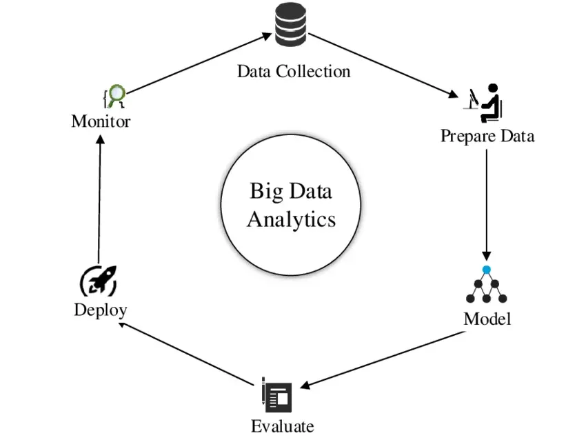
Practical Big Data Analytics
Everyone wants to say they work with big data. The freeing truth is that almost nobody does - and that means your laptop is more powerful than you think.
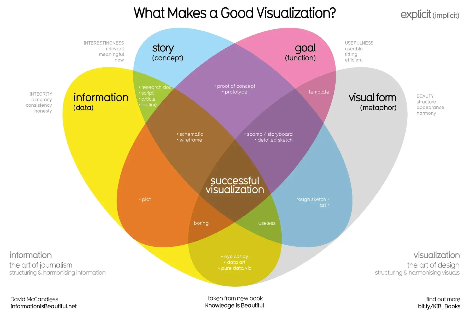
Data Visualization Principles
A good chart is not the one with the most colors or the fanciest 3-D effect. It is the one a reader understands correctly in five seconds. Here is how to make those.
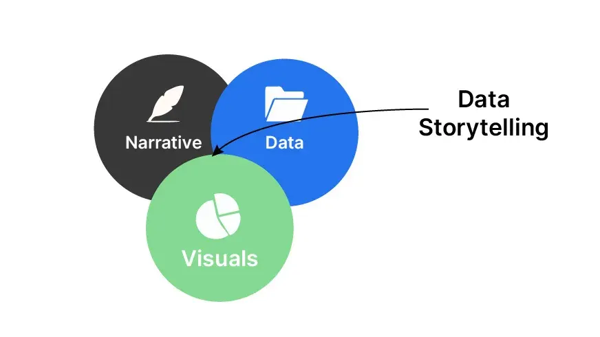
Data Storytelling & Communicating Insights
Your analysis was right. The meeting still ended in "thanks, very interesting." Here is the craft that closes the gap between a correct finding and a changed decision.
Comments
No comments yet. Start the conversation.