Data Storytelling & Communicating Insights
Your analysis was right. The meeting still ended in "thanks, very interesting." Here is the craft that closes the gap between a correct finding and a changed decision.
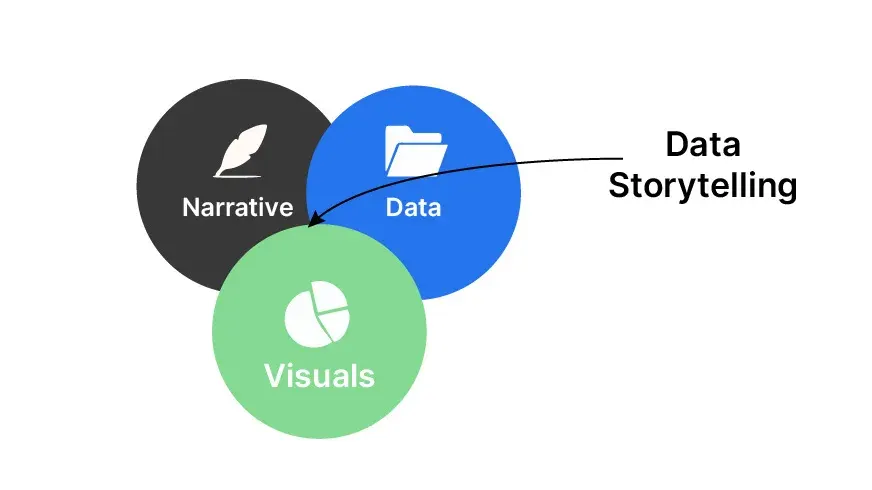
TL;DR
A correct analysis that changes no decision has failed. Data storytelling closes the gap between a finding and action: decide who the audience is, lead with the punchline, give the context that makes the number matter, make it memorable, and end with a clear ask. It is not spin; it is respect for the reader.
On this page
There is a particular kind of silence that haunts analysts. You have spent two weeks on a model. The data is clean, the math is sound, the chart is accurate. You present. People nod. Someone says, “Thanks, this is really interesting.” And then nothing happens. No budget moves, no campaign pauses, no priority shifts. The finding goes into the same drawer as last quarter’s deck, and the world carries on exactly as before.
That silence is not a failure of analysis. It is a failure of communication, and it is the most expensive mistake in the entire discipline. We are trained, sometimes for years, to produce the truth. We are almost never trained to make anyone act on it.
The gap nobody trains you for
Picture a finding as something that has to travel a distance. First it has to be true - and most analysts get it there. Then it has to be understood, which it usually is not, because we bury it under jargon and forty slides of appendix. Then it has to be believed, which requires framing and context we rarely supply. Only then, at the far end, does someone actually decide to do something differently.
Most of us pour ninety-five percent of our effort into the first leg of that journey and almost none into the other three. But a decision only happens when a finding survives all four. A brilliant analysis that nobody understands or acts on has, for practical purposes, the same value as no analysis at all. Put more bluntly: a brilliant insight communicated badly is worth less than an ordinary insight communicated well. The goal was never to be impressive. The goal is to be acted upon.
Storytelling is not spin
Careful analysts flinch at the word “storytelling.” It sounds like dressing up numbers, cherry-picking, nudging an audience toward a predetermined conclusion. If that were what it meant, you would be right to refuse.
But data storytelling is the opposite of spin. Your raw analysis might contain a hundred facts. Your audience can hold about three. Storytelling is the disciplined act of deciding which three matter most for the decision in front of you, ordering them so they make sense, and connecting them to a recommendation. You are not inventing a plot. You are revealing the one the data already supports.
There is a clean test for whether you have crossed the line. Would a competent skeptic, shown your full dataset, agree that your story is a fair summary of it? If yes, you are storytelling. If they would feel misled, you are spinning - and spin destroys the one asset your entire career rests on, which is the assumption that you tell the truth.
Decide who, then say the punchline first
Before you open a single tool, answer two questions. Who exactly are you talking to, and what one thing do you need them to take away?
The same finding must be told differently to different people. A CFO, a frontline manager, and a fellow data scientist need different versions of the same truth, told in different orders. Executives want the answer first, in business terms, with the implication and the ask up front; they will trust your method if you earned it, but they do not want to relive it. Technical peers want the reasoning first, because their job is to catch your errors. Misread the room - lecture a CEO on methodology, or hand a peer-review group only a headline - and you read as either condescending or unconvincing.
Then comes the harder discipline: the single key message. Force yourself to write one sentence answering “so what?” Not three. A presentation with three key messages has zero, because the audience cannot rank them and so retains none. And a strong message is never just a number. “Churn is eight percent” is a fact with no destination. “Churn rose to eight percent, driven entirely by first-month cancellations costing us about two million a year, so we should redesign onboarding before Q4” is a message - because it tells the audience what to do with the fact.
This is where BLUF earns its keep. Bottom Line Up Front: state your conclusion and your recommendation before the supporting detail. It feels backwards, because we are trained to show our work and build to a conclusion the way a proof does. But a busy audience listens in priority order, not chronological order. If your point lives on slide eighteen, most of the room left at slide four.
Make it stick, then make the ask
Even a clear message can evaporate the moment the meeting ends. A few craft moves keep it alive. Give every chart a title that states the takeaway, not the topic - “Churn doubled after the May pricing change,” not “Monthly Churn Rate.” Highlight the one line that matters and grey the rest, because a chart that emphasizes everything emphasizes nothing. Make abstract numbers concrete; “two million a year” lands where “an eight percent rate” does not. And cut the hedging from your speech the way you cut clutter from a chart - “churn doubled, and onboarding is the cause” is remembered, while “what we kind of did was run a model that suggests there might possibly be an issue” is merely endured.
Then close the loop. A presentation without a clear ask is a status update. Name a specific, owned, time-bound action - “approve the two-hundred-thousand onboarding budget” - assign it to someone, and follow up in writing. You did the analysis to change a decision. So name the decision, hand it an owner and a date, and make sure it actually gets made. That, and not the elegance of your model, is what the work was always for.
Key takeaways 5
- Insight that changes nothing is wasted analysis.
- Storytelling is clarity, not spin.
- Know exactly who must decide and what they care about.
- Lead with the conclusion, then the evidence.
- End with a specific recommendation or ask.
Watch & learn

Frequently asked questions
What is data storytelling?
Data storytelling is communicating insights from data by combining analysis, visuals and narrative, so a specific audience understands what matters and what to do next.
How do I present data to executives?
Start with the conclusion and the decision needed, support it with one or two clear charts, explain the business impact and keep the technical details in an appendix.
Why do good analyses get ignored?
Usually because they are presented as methods and charts instead of answers, lack a clear recommendation or don't connect to what the audience cares about.
Go deeper with the free masterclass
Workshop, PDF handbook and curated resources for “Data Storytelling & Communicating Insights”.
Related articles

Machine Learning for Analysts
You do not need a PhD to build a useful model. You need to frame the problem, respect the test set, and know when to stop.

Predictive Maintenance with Sensor Data
A machine never fails silently. It hums, it heats, it spikes for weeks before it dies. Predictive maintenance is just the discipline of learning to listen.
Intro to Statistics for Analysts
You already work with data every day. Here are the five statistical ideas that will stop the numbers from quietly misleading you.
Comments
No comments yet. Start the conversation.