Business Process Mapping & Optimization
Before you buy software to fix a slow process, draw it. A simple map of how work really flows will show you more than any vendor demo - and stop you from automating a mess.
TL;DR
Organizations often buy tools to fix slow processes and end up with the same pain at higher speed. Process mapping, drawing how work actually flows, is a nearly free step that makes invisible work visible, reveals handoffs, waits and rework, and shows what to simplify before anything is automated.
On this page
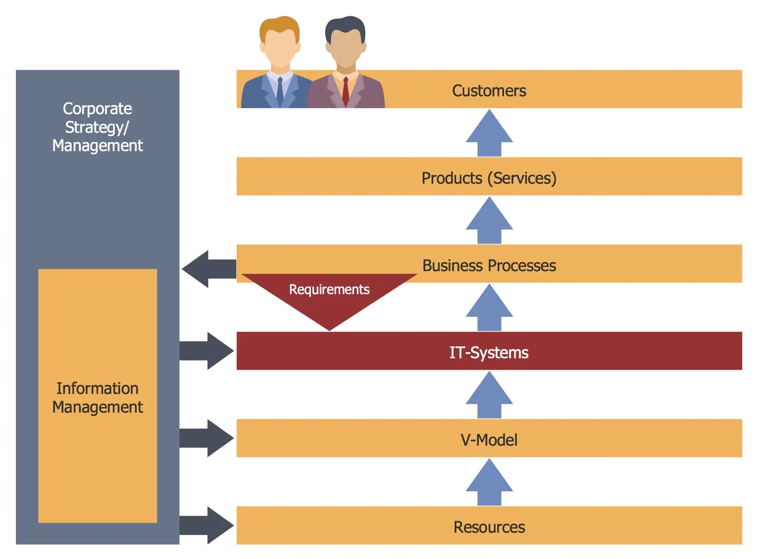
There is a quiet, expensive mistake that organizations of every size keep making. A process feels slow or error-prone, so someone goes shopping for a tool to fix it. The tool gets installed, configured, and rolled out. A few months later the process is just as painful - only now it is painful at higher speed and with a subscription fee attached.
The mistake is skipping a step that costs almost nothing: looking at how the work actually flows before changing it. That looking has a name. It is called process mapping, and it is the most useful business skill that almost nobody is formally taught.
Why work is invisible
Think about any everyday process at your organization. An expense gets reimbursed. A customer complaint gets resolved. A new employee gets set up with a laptop and logins. Now ask: who can draw the whole thing, start to finish, on one sheet of paper?
Usually nobody. Each person knows their own piece. The manager who approves the expense does not see the three days it waited in someone’s inbox first. The IT technician who creates the logins does not know the request sat in a queue for a week before reaching them. The process exists, but it exists only in fragments, scattered across the people who run it.
That scattering is exactly where the trouble lives. Delays happen in the gaps between people. Errors happen when work is handed from one team to another. Effort gets duplicated because two people, each seeing only their own part, both decide to keep a spreadsheet “just in case.” None of this is visible from any single desk - and what you cannot see, you cannot fix.
Making it visible
A process map is simply a picture of the steps that turn an input into an output, who does each one, and how the work passes between them. The most useful kind for office work is the swimlane diagram. You draw one row, or “lane,” for each person or team, place each step in the lane of whoever performs it, and draw arrows for the flow.
The magic is in the arrows that cross between lanes. Those are handoffs, and handoffs are where most delay and error hide. A map with four crossing arrows is telling you, plainly, that the work changes hands four times - and each change is a chance to wait, to lose information, or to make a mistake.
Drawing the map is not a desk exercise. You have to go and watch the work happen, and talk to the people who do it. The Japanese term for this is gemba - “the actual place.” Sit beside the person keying in invoices and you will see the sticky note on the monitor, the second login halfway through, the workaround they no longer even notice. Those details never come up in a meeting. They are the whole story.
One warning: draw the process as it really is, not as it is supposed to be. The honest, slightly embarrassing version is the one worth having. If you quietly map an idealized flow, every conclusion you draw afterward will be built on fiction.
Reading the map
Once the real picture is on the wall, patterns jump out. The biggest is usually waiting. In most office processes, the actual hands-on work takes minutes, but the whole thing stretches across days or weeks because the work spends almost all its life sitting in a queue. It is common for the real working time to be under one percent of the total elapsed time.
That sounds dreadful, but it is good news. It means the opportunity is not in making people work faster - they are barely working at all in the gaps. The opportunity is in the waiting, the rework, and the handoffs. Lean practitioners group this wasted effort into eight categories, remembered by the word DOWNTIME: defects, overproduction, waiting, non-utilized talent, transportation, inventory, motion, and extra-processing. With the map in front of you, you can point at each one.
Look, too, for the bottleneck: the single step where work piles up because it cannot keep pace. A counterintuitive but reliable rule is that improving any step except the bottleneck does nothing for the overall speed. Speed up an early step and you simply grow the queue in front of the constraint. Fix the bottleneck first; everything else is secondary.
Then, and only then, automate
When you redesign, work in order: eliminate steps that add nothing, simplify what remains, combine steps split for no reason, run independent steps in parallel, and relieve the bottleneck. Automation comes last, applied to a process that is already clean. An auto-approval rule for small expenses is brilliant - but only after you have asked whether those expenses ever truly needed approval in the first place.
And measure. Write down the lead time, the number of steps, and the rework rate before you change anything, then check the same numbers afterward. Without that baseline you have a story; with it you have proof - and proof is what keeps an improvement from quietly slipping back to the old way.
None of this requires special software or a consultant. It requires a wall, some sticky notes, the people who do the work, and a couple of honest hours. Draw the process first. The clarity you get is the cheapest competitive advantage available to any team.
Key takeaways 5
- Buying a tool before understanding the process automates the mess.
- Work is invisible until you draw how it really flows.
- Map the real process with the people who do the work, not the official one.
- Look for handoffs, waiting, rework and duplicated steps.
- Simplify first, then automate what remains.
Watch & learn

Frequently asked questions
What is business process mapping?
It is the practice of visually documenting the steps, people, systems and handoffs in a process, often as a flowchart or swimlane diagram, to understand how work really gets done.
Why map a process before automating it?
Because automating a broken process only makes the problems happen faster. Mapping exposes unnecessary steps, delays and rework that should be removed first.
What is a swimlane diagram?
A swimlane diagram is a process map divided into lanes, one per person, team or system, which makes handoffs and responsibilities easy to see.
Go deeper with the free masterclass
Workshop, PDF handbook and curated resources for “Business Process Mapping & Optimization”.
Related articles
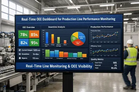
OEE & Real-Time Production Monitoring
OEE turns the messy reality of a production line into one honest number - and real-time monitoring turns that number into daily improvement. Here is how the metric works and how to make it actually move.
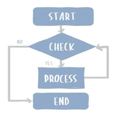
Introduction to Flowcharts
Flowcharts are a powerful visual tool that can help you analyze, design, document, and manage workflows or processes.
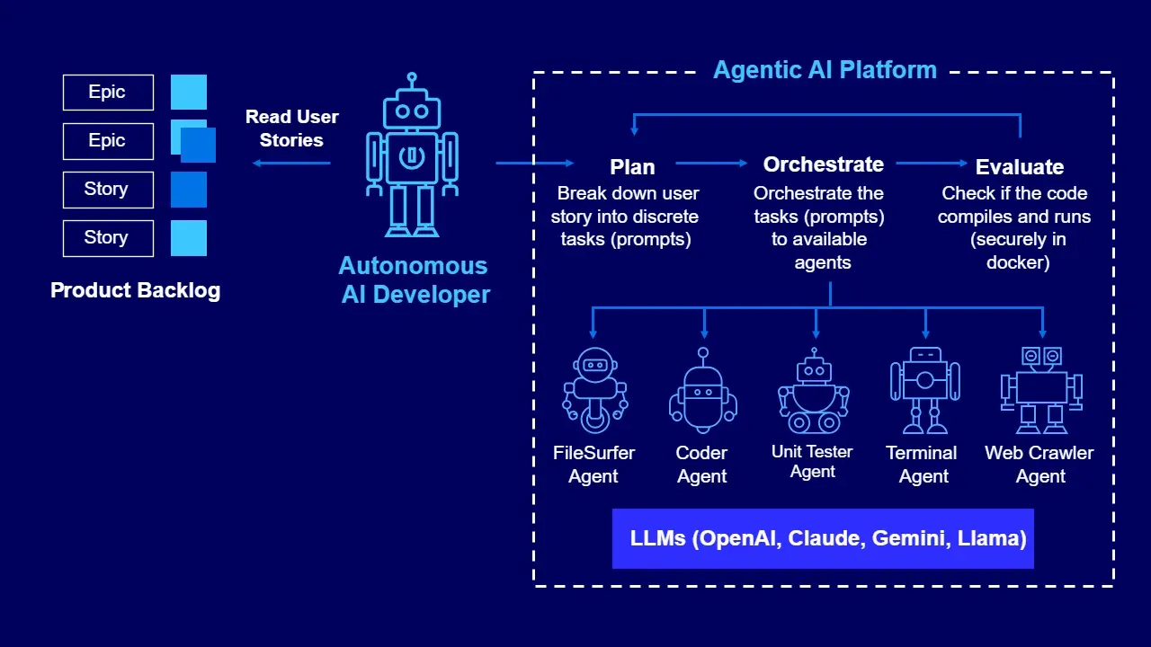
Agentic Automation: AI Agents for Business Processes
AI agents are not smarter chatbots or fancier macros — they are a third kind of automation, and the teams that win will be the ones who learn exactly where it fits.
Comments
No comments yet. Start the conversation.